

DoorDash: Adding a Customer Loyalty Feature
How might we solve the customer disloyalty problem in the food delivery service app industry?
My Role (conceptual project): UX Researcher, UX & Designer
Case Summary
Product Vision
The food delivery app industry has a customer disloyalty problem. On top of that, companies have still been struggling to prove profitability. I wanted to find a way for DoorDash to increase customer loyalty in a way that would benefit the company and customers alike.
Discovered User Problem
Customers are looking for convenient options to have their food delivered when they want to prioritize other activities over cooking but are often turned away by high fees and will bounce between apps to find the cheapest option.
Outcome
A rewards program that incentivizes users with earning points and encourages them to along the way to their next reward. Users can also earn badges by supporting businesses and social/ environmental causes.

Spoiler alert!
If you want to jump ahead, I put together the final prototype in Figma for you to check out. Otherwise, I’ve also embedded it at the end of the case study below.
Overview
It’s a weekday evening - I’m busy, tired and hungry. The thought of going to the store and then coming home to cook is just too much. So I grab my phone and start browsing a food delivery app.
“Ooo that sounds good.” I browse the menu and add items to my cart. Then I go to check out, and bam! The total cost is so much higher with all the unexpected added fees. So I open my other apps to see if I can order from the same place at a lower price or score a better deal.
And that’s how the industry-wide customer disloyalty issue happens. Customers often bounce around between multiple apps to see where they can score the cheapest meal.
On the business side, the food delivery mobile app industry is huge, but companies are still having difficulty in proving profitability.
Project Constraints
Because DoorDash is a popular app with many existing users, I wanted to keep any new features as minimally disruptive as possible and work into users’ existing flows.
Design Process
-
Methods:
Market Research
Competitive Analysis
Provisional Personas
1:1 User Interviews
Empathy Mapping
-
Methods:
User Personas
Point of View Statements & How Might We Questions
Business & User Goals
-
Brainstorming
Product Roadmap
Information Architecture
Sitemap
UI Requirements
Interaction Design
Task & User Flows
Low-fidelity Sketches
Mid-fidelity Wireframes
-
Methods:
User Interface Design
Mood Board
Brand Logo
Style Tile
High-fidelity Wireframes
UI Kit
-
Methods:
High-fidelity Prototype
Usability Testing
Affinity Mapping
Priority Revisions
1. Research
Research Goals
Learn about the food delivery service market
Uncover people’s motivations for and feelings towards using food delivery apps
Understand the state of the food delivery service market
Identify market opportunities for DoorDash
Methods
Market Research
Competitive Analysis
Provisional Personas
1:1 User Interviews
Empathy Mapping
Market Research
Food delivery service industry overview
Global revenue in online food delivery has almost doubled since 2017 and is expected to reach $97B worldwide by 2024
U.S. food delivery revenue had reached $26.5B in 2021, but companies aren’t profitable
Food delivery during COVID-19 pandemic
Even at the height of industry success during the pandemic, all of its leaders have failed to gain profitability
Visible point of conflict: high commission fees (30%) make it difficult for businesses to generate a profit when working with already small margins
City governments have intervened with commission caps (usually a max of 15%) to protect businesses
Customer Loyalty: fewer of today’s diners are loyal to just one service
Competitive Analysis
To pinpoint where DoorDash fit into the industry, I conducted a competitive analysis of direct competitors and one indirect. I chose Hello Fresh as the indirect competitor to evaluate because the meal kit delivery industry is directly adjacent to food delivery, and its customers could serve as good potential prospects.
User Interviews
Now that I understood the problems in the industry at a market level, I wanted to understand customers’ use of the product on a personal level. So I conducted 5 user interviews to ask people about their experiences using delivery apps to identify their behaviors and motivations for using them. Knowing this information would help me identify their pain points and opportunities to meet and solve them.
Participant 1
In a relationship, Millennial
Participant 4
Single, Millennial
Participant 6
Single, Millennial
“I kind of switch between Uber Eats and DoorDash - DoorDash because my boyfriend’s card is on it, so I’ll charge it to his.”
“My motivations are laziness and being unmotivated to cook a meal. During the pandemic when restaurants were closed, it was a way for us to replace eating out.”
“I order food when I’m too tired or don’t have food to cook. It’s out of necessity. I’d rather cook or go to a restaurant. I don’t want to eat food out of plastic containers, but it’s convenient.”
User Interviews Insights
Armed with my pages of transcribed interview notes, I needed a way to organize the feedback so I could examine what I discovered about our user. I created an empathy map from my interview responses by categorizing them, identifying patterns, and extracting insights to determine needs.
Key Insights
Users don’t want to cook because they feel lazy or tired.
Users need incentives to make more purchases with a specific brand and enjoy rewards programs that feel effortless.
Users order food to save time and prioritize other activities.
Users care about supporting small businesses and social causes.


2. Define
Define Stage Goals
Define the user and determine their needs based on my research insights
Think about how we can meet their needs
Methods
User Personas
Point of View Statements & How Might We Questions
Business & User Goals
User Personas
To step into the shoes of and understand the user, I created user personas that reflected the pain points and motivations gathered from my interviews.
An interesting insight that emerged was that there were two types of users with differing motivations. One set uses food delivery as a luxury or way to treat themselves, whereas another set uses it to save time but would prefer to have a “real” dining experience. These personas reflect these and other differences.
3. Ideate
Ideate Goals
Come up with product ideas and prioritize
Ideate on design solutions and visual layout
Methods:
Brainstorming
Product Roadmap
Information Architecture
Sitemap
Interaction Design
Task & User Flows
Low-fidelity Sketches
Product Ideation
I used the insights and needs to construct problem statements and HMW questions to brainstorm for potential solutions. Brainstorming on my own later helped me evaluate my ideas compared to the group session.
How might we encourage users to place a delivery order?
But I also knew that users cared about supporting local businesses, so I wanted to lean into this motivation to encourage user behavior, rather than only looking to address needs.
Group Brainstorming
I decided to organize a group brainstorm to leverage a diverse set of perspectives and greater creativity when problem-solving for solutions. This worked, and I walked away with more varied and stronger product ideas than my individual brainstorm.
As the facilitator, I started the meeting by explaining the project goals and going over user personas, insights, and needs so the team understood who we were designing for. I encouraged the team by saying that the emphasis was on quantity over quality of ideas.
Using the rapid ideation method, we started with a HMW question, ideated individually, then had a longer timed group discussion. We used stickies.io to transfer our ideas onto notes, explained our ideas, and then had a round of voting. Each person was given 3 votes per round.

Please excuse my crazy eyes
Group Brainstorm Key Ideas:
Activity feed: allows users to get ideas for restaurants to try and engage with each other in a simple way, similar to Venmo
Rewards program: lets users earn points and rewards from their purchases
My Profile: user can control the settings on their social profile
Badges: users can earn badges for supporting causes or restaurants and are visible on their profiles
Business personalization & photos: businesses can add a personal message that appears on their business page and link to their social media to showcase their brand and photos
Information Architecture
Features Prioritization
After determining the new features we’d be moving forward with, I needed to prioritize how to approach the work. To do this, I created a product roadmap that outlined the new features and existing areas of the app that would need to be changed. I prioritized them with the MoSCoW method. This included the potential impact and projected effort for each feature.
App Map & UI Requirements
Before adding the new features, I needed to assess the app’s existing structure to determine the best way to implement the new feature. I created an app map to analyze the structure and added in the new customer loyalty rewards features and screens.
I added the Activity Feed to the Search tab as a sub-nav so that users would see it when they went to search for food ideas. I also made the My Profile and My Rewards sections accessible through the Accounts screen.

Interaction Design
Task & User Flows
These were the task flows I outlined and would ask users to complete during usability testing.
Check your rewards progress to see how close you are to your next reward
Go to your activity feed - place an order from a restaurant your friend recently ordered from
View the badges you’ve earned
I researched commonly used design patterns and studied popular applications for industry standards regarding rewards programs, gamification badges and activity feeds.
A section of the user flow that shows paths to access the new My Profile and My Rewards features.
4. Design
Design Goals
Generate low-fidelity design layout ideas
Create high-fidelity wireframes
Organize the design features and components
Methods
UI Design
Mood Board
Brand Logo
Style Tile
High-fidelity Wireframes
UI Kit
Low-fidelity Sketches
Referencing my sitemap, flows and UI requirements, I sketched ideas for each screen using a variety of layout structures and navigation patterns.

High-fidelity Designs
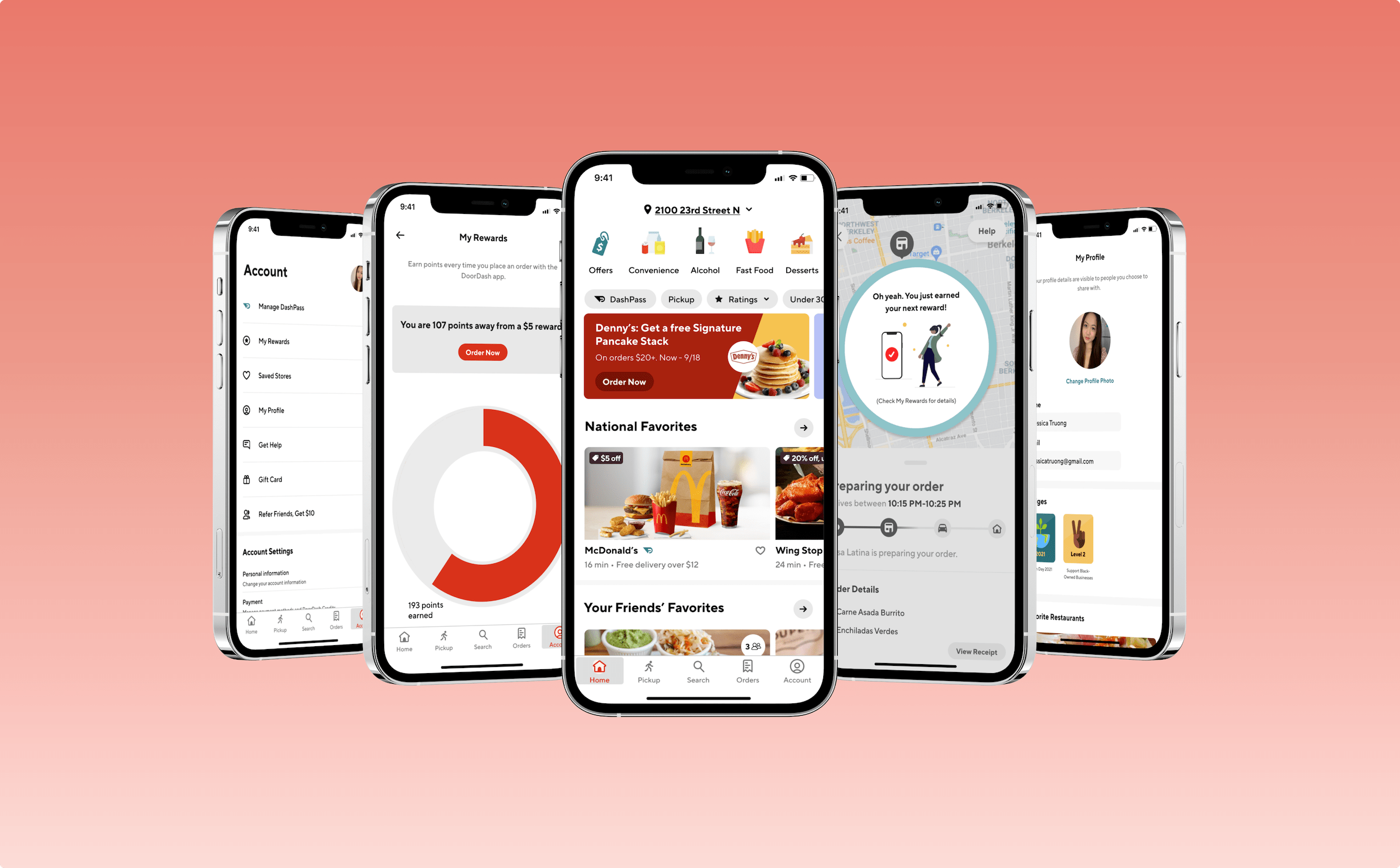
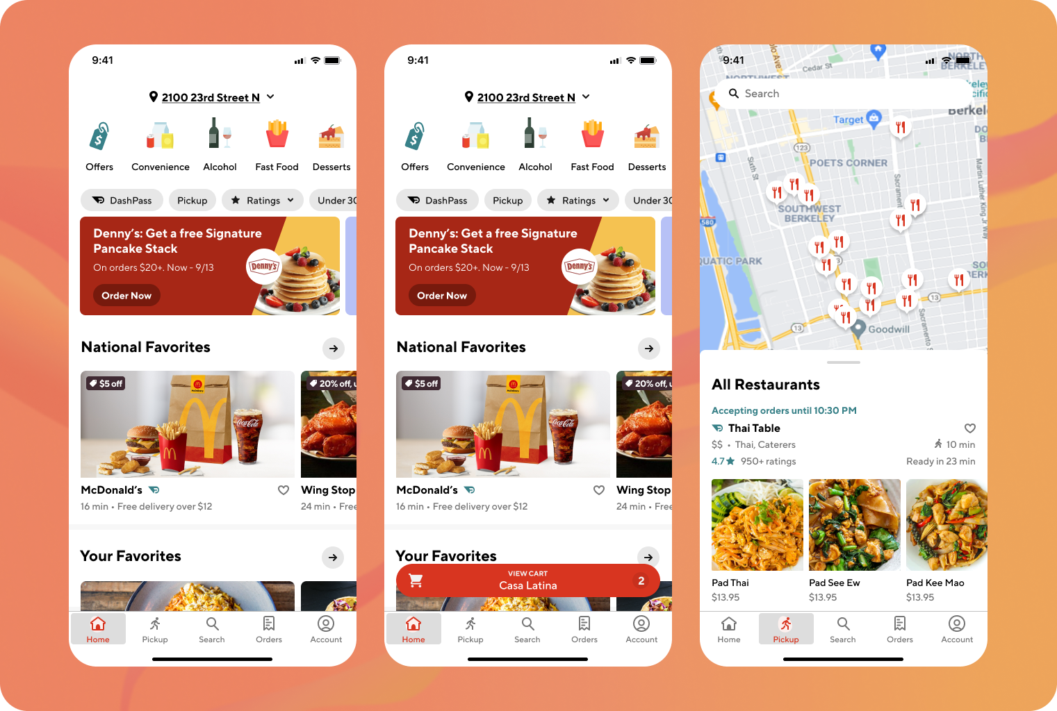
After getting feedback on my low-fidelity sketches from a design critique meeting, it was time to move into Figma to create the high-fidelity wireframes. I created app screens of the existing DoorDash app and created new screens/features that worked in line with the app’s visual identity.
The new features included:
Activity Feed added into the Search tab
Inclusion of My Profile and My Rewards into the Account tab
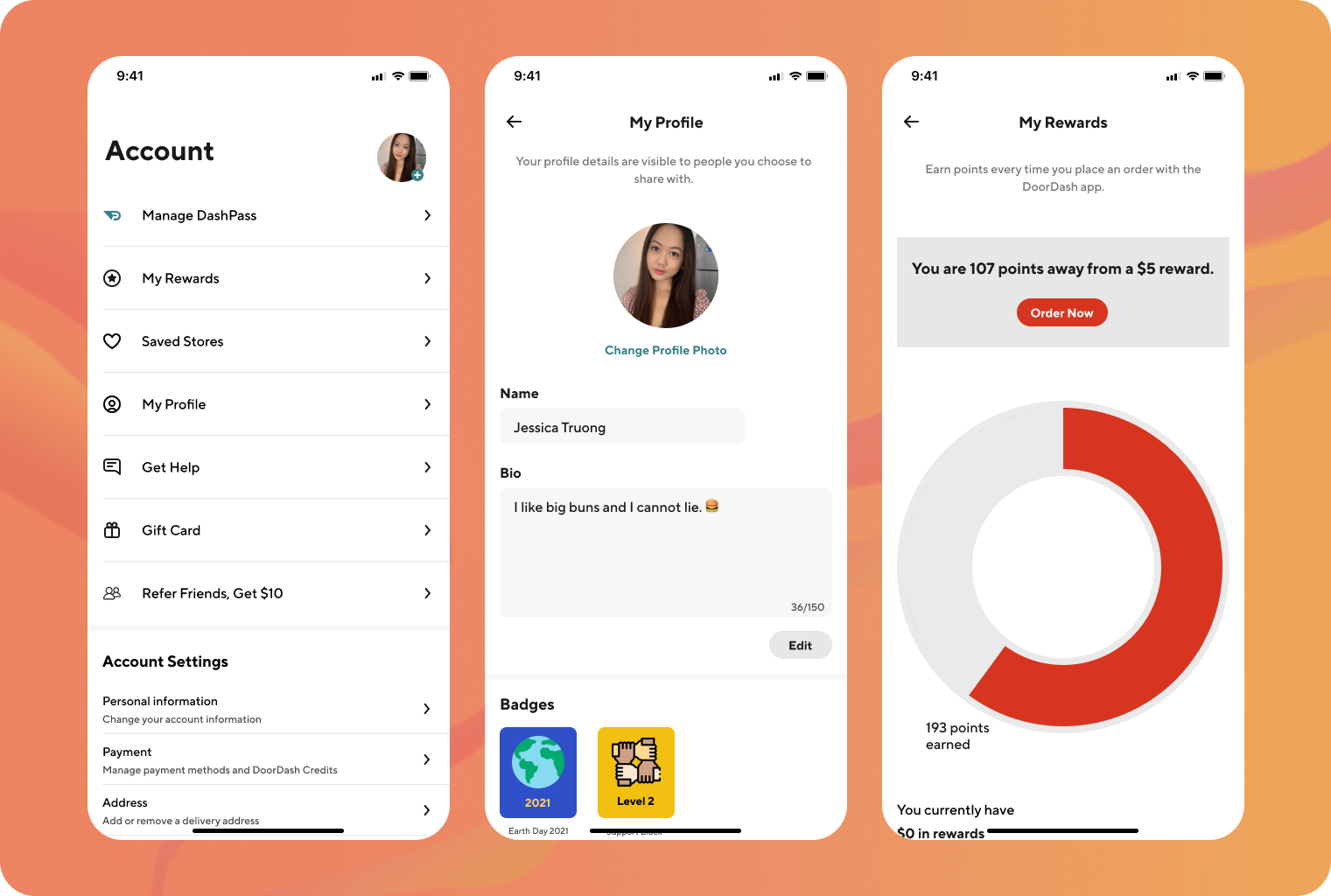
My Rewards screen
My Profile screen
Business stories for personalization


UI Kit
I organized all my Figma components into a UI Kit to clearly outline the app’s visual identity and help speed up future design processes with ready-to-use UI elements. It also ensures that the product maintains a cohesive visual identity, even as it scales.

5. Test
Testing goals
Determine the usability of the design
Identify points of friction in the design and rectify deficiencies
Understand what features are the most or least engaging for users
Methods
High-fidelity Prototype
Usability Testing
Affinity Mapping
Priority Revisions
Usability Testing with High-fidelity Prototype
I created a high-fidelity prototype to conduct moderated testing with 6 participants. I wanted to know if the implementation of the new features matched users’ mental models and identify areas to improve. To pass, each task needed to demonstrate an 85% or above error-free rate.
Usability Testing Surprising Find
Because a user didn’t know what an activity feed was, she wasn’t able to complete the task of finding the feed. Additionally, two others had a difficult time.
The overall error-free rate came in at 77%. I determined that the location of the Feed didn’t match users’ mental models - they didn’t associate it with the Search feature. The feature needed to be redesigned.
Usability Testing Insights
I created an affinity map of user feedback and behaviors and created an affinity map to identify patterns and insights. I focused on paint points over what worked to improve the design’s functionality

1. Users had a difficult time understanding/finding the activity feed. It also included too much information that users didn’t care to know.
Recommendation: Group recommendations in an existing area of the app alongside other useful information.
On the Home screen, include a list of restaurants called “Your Friends’ Favorites” and show the number of friends who’ve ordered from them.
2. Users didn’t intuitively think to check the Search tab to find the activity Feed and had difficulty locating it.
Recommendation: Remove the Feed screen from the Search tab and instead make a restaurant recommendations section on the Home screen.


3. Users wondered about options for privacy regarding their app activity and how sharing is enabled to feel comfortable with the feature.
“What if I don’t want people to see that I ordered McDonald’s at midnight?”
Recommendation: In the Account tab under Settings, add an item for “Friends & Social” that allows users to connect their “Phone Contacts” and “Facebook Contacts” with toggles.
Priority Revisions to High-fidelity Wireframes

1. Added a “Your Friends’ Favorites” section to the Home screen
An icon shows the number of friends who have ordered from that restaurant
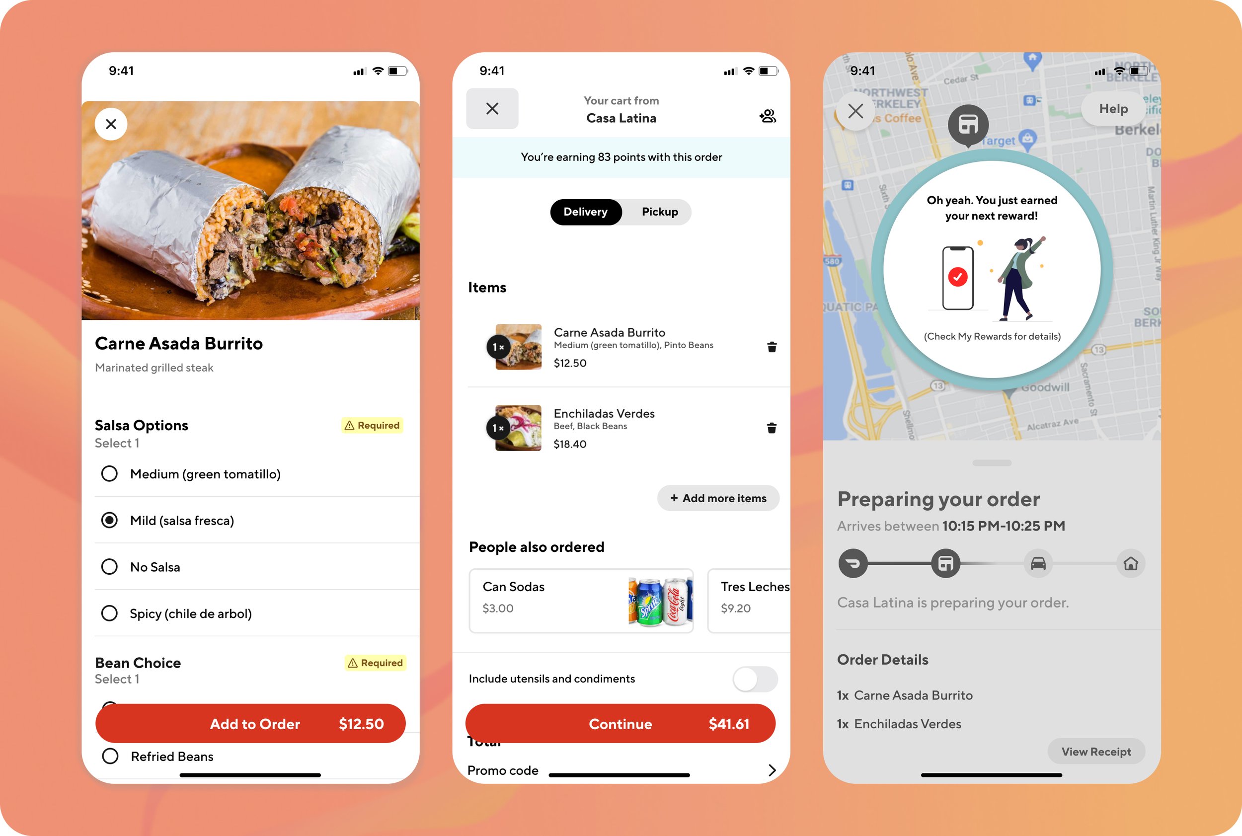
2. Earned new reward notification to the Order Confirmation screen
3. Added a Friends & Social list item to Account and a screen so users can easily control their settings

4. Removed Activity Feed from Search tab
5. Simplified My Profile screen, removing the Bio section, since users will no longer be able to view each others’ profiles
Final Prototype
Reflection & Next Steps
Key Learnings
It’s important to design according to users’ existing mental models of the app by grouping like items together, or else the design will result in user confusion and a disruptive user experience.
Because I designed the app from the ground up but didn’t have access to a UI Kit, I had to spend extra time on things such as matching the typography and creating all of the visual components, including the wide set of icons used across the app.
Creating an icon set can be time-consuming, but any inconsistency between icons is easy to see and creates a disjointed visual identity
Next Steps
Test the reworked and new screens for the DoorDash Rewards and recommendations features
Present and hand over designs to the engineering team
Serve as a guidepost throughout the engineering team’s implementation process
Create an introduction for users to become acquainted with the new rewards system
Additional screens to create:
Rewards: “How does it work?”
Redeemed rewards
Earn new badge promotions
View Other Projects

Cookie Jar App Product Design Case Study

Cedar Motivating Patients to Pay Case Study

DCP Realty Responsive Website Case Study