


Cookie Jar: Product Design Case Study
How might we help people address loneliness in a digitally connected world?
My Role: Product Designer, UX Researcher, UX/UI Designer
Case Summary
Product Vision
Throughout points in my life, I’ve experienced the pain of loneliness and often struggled to find a way out. And for the past few years, we’ve seen the negative impacts of social media on mental health.
I wanted to understand how, when, and why people experience loneliness and what they can do to solve it.
Discovered User Problem
I discovered that users most often felt lonely at group gatherings with unfamiliar people. Rather than looking to create new social groups, users were interested in making deeper connections within their existing circles. They also often felt deterred to reach out if it felt like too much effort to make plans.
Outcome
Cookie Jar is an app that encourages users to share activities and join events with people in their existing social circles. Do you enjoy climbing and see that your friend is bouldering on Wed? Join them! Users can also chat and coordinate with friends through messaging.
Spoiler alert
If you want to jump ahead, I put together the final prototype in Figma for you to check out. Otherwise, I’ve also embedded it at the end of the case study.

Project Constraints
Because loneliness is often associated with mental health disorders like depression and anxiety, I knew I had to stay within the limitations of a lifestyle category and be careful not to cross into areas that should be addressed by mental health professionals.
Design Process
-
Methods:
Market Research
Competitive Analysis
Provisional Personas
1:1 User Interviews
Empathy Mapping
-
Methods:
User Persona
Point of View Statements & How Might We Questions
Brainstorming
Storyboarding
-
Methods:
Product Roadmap
Information Architecture
Sitemap & UI Requirements
Task Flows
Low-fidelity Wireframe Sketches
Mid-fidelity Wireframes
-
Methods:
Mid-fidelity Prototype
Usability Testing
Affinity Mapping
Mid-fidelity Wireframe Updates
-
Methods:
Mood Board
Brand Logo Design
Style Tile
UI Kit
High-fidelity Designs
High-fidelity Prototype
1. Research
What is loneliness, how are people affected by it, and what is the market that addresses it?
Methodology: Market Research, Competitive Analysis, Provisional Personas, User Interviews, Empathy Mapping
Market Research
Loneliness has both mental and physical effects
Loneliness was on the rise before the pandemic, but the pandemic has increased how often people experience it
Social media can increase feelings of loneliness
Demographics: 25% of adults ages 18-27 reported having no close friends, 22% reported having no friends at all
Combatting loneliness: It’s not the quantity of social interaction that combats loneliness, but the quality
To find out when people feel lonely and what they do to try to combat it, I interviewed five people about their experiences to identify their needs, motivations and pain points.
User Interviews
Participant 1
In a relationship, Gen Z
Participant 2
Single, Millennial
Participant 5
In a relationship, Millennial
“I feel lonely when I’m not getting that interaction to fill my social meter - not that there’s a set amount - with quality interactions with people.”
“I feel lonely when it’s a Friday night after work, and I haven’t made plans. I’m wondering what to do, but all my options seem mediocre.”
“I feel most lonely at larger gatherings or if everyone just met for the first time.”
“When I feel lonely, I’ll do an activity like play basketball with friends, which is different because I just talk to my girlfriend.”
“When I feel lonely, I usually try to occupy my mind and do something. I’ll work out, go for a bike ride, climb, or take my dog out.”
“Sometimes I’ll call one of my friends, but sometimes I’m too lazy. I try to do things I like, start a new show or book.”
Primary Research Insights
What do users need?
After completing interviews, I created an empathy map to organize people’s responses and identify patterns and insights.
Key Insights:
People aren’t looking to make new friends but need a way to more deeply connect with their existing circles.
Users don’t act on making plan when it feels like too much effort, so they need an easier way to make plans with friends.
Users need a way to easily keep in touch with friends virtually at any time.
Users feel most lonely at group gatherings amongst acquaintances or strangers.
2. Define
Who is the user, and what do they need?
Methods: User Personas, HMW Questions, Brainstorming, Storyboarding
User Persona
To step into the user’s shoes and gain a deeper understanding of what they face, I created a user persona that served as a guiding point when making critical product decisions.
HMW Questions
I used my empathy map insights and needs to form problem statements and How Might We (HMW) questions to kick off brainstorming for solutions.
How might we help users combat loneliness in a way that doesn’t require “too much” effort?
How might we encourage users to combat loneliness by connecting virtually with friends?
Storyboarding
I created a storyboard to help visualize the user, their environment and how they’d use the app.
It’s the weekend, and Victoria is binge-watching shows because she doesn’t know what else to do. She misses her friends back home and uses the Cookie Jar question prompt feature to generate light-hearted conversation on a topic they normally wouldn’t discuss. She laughs and feels connected with her friends.
3. Ideate
Shaping the product’s features and user experience
Methods: Product Roadmap, Sitemap, Task & User Flows, Sketches, Mid-fidelity Wireframes
Product Roadmap
Users needed a lower effort way to connect more deeply with friends, so I decided to tackle their pain points with an app that encouraged conversations around non-traditional topics and question prompts. Later on, I wanted to give users an easy way to make plans with friends.
Feature prioritization:
Navbar: Chats, Events, Contacts & Settings
Sign-up flow
Chat overview screen with a system to connect with their contacts
Create a chat group and message flow
Question prompt feature with categories
A calendar system that allows users to join events and create their own
Contacts screen
Settings screen to manage their account
Information Architecture
App Map & UI Requirements
To clearly define how the app would be structured, I created a Sitemap based on the priority features and a UI Requirements doc that detailed the elements and content that needed to be included on each screen.
I researched the best ways to organize navigation and sub-nav, as well as referenced Apple’s Human Interface Guidelines for things like sizing, spacing and icon usage.
Task & User Flows
In order to develop the MVP product, I needed to know which screens and features would need to be created for users to accomplish their goals. To do this, I created task and user flows that outlined the pathways a user could take to complete key tasks.
Signing up for Cookie Jar
Using the question prompt chat feature
Responding to a notification from a friend’s question prompt
Joining a friend’s event on the calendar
Low-fidelity Sketches
Referencing my sitemap, flows and UI requirements, I sketched ideas for each screen that showed a variety of layout structures and navigation patterns. I thought through things like, “How will users access the question prompt feature?” and “How can I allow users to easily make plans with friends?”
Mid-fidelity Wireframes
After getting feedback on my sketches from my mentor and peers in design critique, I took the most promising sketches and created mid-fidelity wireframes in Figma.
4. Test
Usability testing goals
Identify points of friction in the design and rectify deficiencies
Determine the usability of the design for users
Understand what features are the most or least engaging for users
Observe user behavior and gather feedback
Methods
Mid-fidelity Prototype
Usability Testing
Affinity Mapping
Midfi Wireframe Updates
Usability Testing
I conducted usability testing with 7 participants at mid-fidelity so users could focus on the experience rather than the visual design. I wanted to identify problem areas and learn more about users’ behaviors and preferences when wanting to connect with their friends.
Usability Testing Results
A Shift in Product Direction
Users revealed that, while they thought the question prompt feature was a fun idea, they were unlikely to reach for it regularly while chatting with friends.
What they expressed more interest in was the calendar sharing feature and being able to join friends’ events because it removed the barriers of having to reach out and then figure out what to do to make plans. They could also discover and try out new activities or share their own hobbies with friends. As a result, I shifted the product focus to prioritize the events feature.
Priority Revisions
The usability tests helped me understand what was confusing or more valuable to users, and I took those insights to improve the user experience.
Creating a Welcome Wizard
Users weren’t clear on the differentiators in the app and were confused about how features the question prompt and events features worked.
Solution: I created a welcome wizard that appears after users sign up.
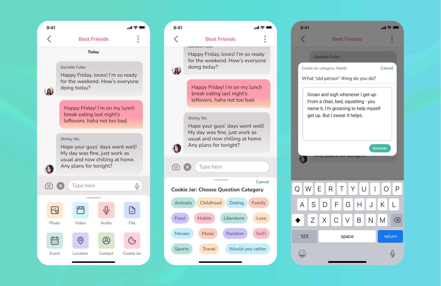
Cookie Jar Question Feature
After trying the question prompt feature, participants shared that the feature seemed fun, but they were unlikely to reach for it regularly.
Solution: Deprioritize the feature (no standalone icon in the chat), and group it with all the other attachment options.
General Upcoming Events vs. Day-Specific Events
“What’s the difference between Upcoming Events and the Events listed on the bottom?” - Test Participants
Solution: Change from “Upcoming Events” to “Explore Upcoming Events” to differentiate between the general list of upcoming events vs. events shown below for a specific day selected from the calendar.
Event Details Screen: Comments
“If I have a question about the event, do I have to message her separately?” - Test participant
Solution: See the event host’s welcome message, and create a comment/thread system so the user can comment or ask questions directly on the event screen.


Joined Events: My Events Sub-nav
Users wanted to know how they could easily see the events they’ve joined or created.
Solution: I added a sub-navigation to Events to separate “All Calendars” from “My Events” so users can see the events they’ve created or joined in one place.
Joined Event Confirmation
“Cool, I joined the event. So do I have to let my friend know that I’m going to her event?” - Test participants
Solution: Add a confirmation modal screen to appear after saving the event to their cal to let them know their friend has been notified.
5. Design
Brand identity and high-fidelity designs
Methods: Mood Board, Brand Logo Design, Style Tile, UI Kit, Hi-fidelity Designs & Prototype
Cookie Jar’s name is a reference to the idea of reaching into a jar full of idea-filled papers and pulling one out. I wanted the brand attributes to be happy, charming and inviting.
Once again referencing Apple’s Human Interface Guidelines, I set out to create a logo that was recognizable and embraced simplicity.
I also played around with creating a 3D version of the cookie mascot!
Creating Cookie Jar’s Brand Identity


Style Guide
I explored color palettes and fonts until I found ones that fit the brand and worked well for the UI. I wanted a palette that was bright and uplifting. My style guide laid the foundation to build a cohesive visual language.
UI Kit
Here’s the UI Kit I created to organize my components into a modular, cohesive library.
This would help me speed up future design processes by allowing me to rely on ready-to-use UI elements and avoid having to create new ones from scratch.
High-fidelity Mockups
I then applied the visual design to my screens and created components that gave the app the brand’s personality. I spent a lot of time creating a calendar module for the Events screen with different variant states to indicate date selection, scheduled events, and joined events.


High-fidelity Final Prototype
Key Learnings
Usability Testing: It’s important to take note of users’ reactions and behaviors, not just verbal feedback to uncover insights and even re-prioritize the roadmap.
Visual Design: Color schemes are a guide and not a steadfast rule. I can adjust the HSB provided by a color wheel generator to fit my design.
Icons: Determining all of the icons that will be needed and creating my icon library prevents me from having design flow interruptions later on.
Design Tools: Using Figma’s Text & Color Styles helps me build a style library and gives me greater control. When I wanted to adjust make adjustments, it applied the changes to every element using that style.
Next Steps
Hand off designs to the development team and provide support throughout the build process
Screens and features to add:
Send a link to invite others to join the app or a group chat
Individual chat settings screen
Allow for multiple hosts of an event
Allow users to invite people to a friend’s event
Additional user testing
View Other Projects

Cedar Motivating Patients User Research & Concept Testing

DoorDash Adding a Customer Loyalty Feature Case Study

DCP Realty Local Business Website Case Study