


DCP Realty: Responsive Real Estate Brokerage Website Design
How might we establish a local business's online presence to be competitive and attract new clients?
My Role: UX Researcher, UX & UI Designer, Web Designer, UX Consultant
Case Summary
Product Vision
Establish DCP’s online brand, attract new clients and agents, and allow them to browse their available listings.
Discovered User Problem
Potential clients, feeling like they don’t anything about purchasing real estate, need to find someone they can fully trust to expertly guide them through the homebuying process.
Outcome
A website with a clear brand identity that showcases DCP’s agents and properties, builds trust with thoughtful content, and gives users multiple ways to easily get in touch.
Overview
DCP Realty is a real estate company located in South San Francisco, CA that’s been in business since 2004. DCP wanted to establish its online presence and stand out from competitors. Specifically, stakeholders wanted the site to attract new clients, showcase listings, and contact them. They also wanted to let agents know they were hiring.
The Challenge
People rely on online search to find or verify companies and agents they’re interested in working with. All of the local competitors I researched had active websites (if I missed any because they didn’t have a site, then case in point).
When the project started, DCP did not have a website - their only online presence included a Facebook page and minimal listings on MLS (Multiple Listing Service) platforms. All of the site content would have to be built from scratch.
Spoiler alert
If you want to jump ahead, I put together the final prototype in Figma for you to check out. Otherwise, I’ve also embedded it at the end of the case study below.
Design Process
-
Methods:
Research Plan
Market Research
Competitive Analysis
Provisional Personas
Heuristic Evaluation
1:1 User Interviews
Interview Guide
Empathy Mapping
-
Methods:
User Personas
Point of View Statements & How Might We Questions
Brainstorming
Group Brainstorming
Business & User Goals
-
Methods:
Product Roadmap
Information Architecture
Sitemap
UI Requirements
Task Flows
User Flow
Low-fidelity Wireframe Sketches
-
Methods:
Mid-fidelity Prototype
Usability Testing
Affinity Mapping
Mid-fidelity Priority Revisions
-
Methods:
High-fidelity Wireframes
Style Tile
UI Kit
1. Research
Research Goals
Learn about the real estate industry and the state of the market in the SF Bay Area
Identify users’ pain points, needs and motivations
Understand who DCP Realty’s competitors are
Methods:
Market Research
Competitive Analysis
Provisional Personas
Heuristic Evaluation
User Interviews
Empathy Mapping
Market Research
After kickoff calls with the director and lead agent, I conducted hours of market research to learn about the state of the industry and demographics of home buyers.
Home prices around the SF Bay Area continue to increase exponentially, while affordability decreases. Bidding wars have hit new all-time highs, while housing inventory declined up to 39% from the COVID-19 impact.
The largest generational group of buyers are older millennials (25%), followed by buyers 40 to 54 years old (23%). 33% were first-time buyers.
Competitive Analysis
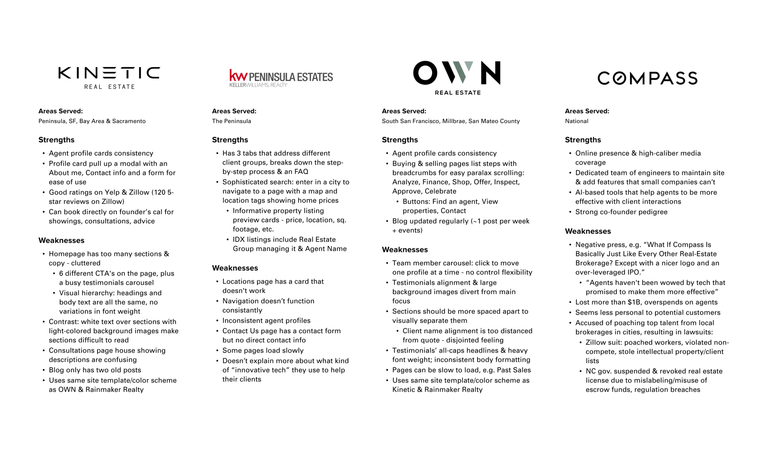
I researched many competitors in the Bay Area and chose to narrow my scope by analyzing two popular independent brokerages and two franchise brokerages that operate internationally.
One of those franchises is Compass, a VC-funded darling ($1.5B), that was founded to disrupt the real estate brokerage industry with proprietary technology that is supposed to make their agents more effective.
User Interviews
Because the SF Bay Area is one of the most expensive places to purchase a property, it was difficult for me to gather participants who had purchased or sold a home here within the last five years. I chose that timeframe because I wanted their experiences to reflect the current competitive market conditions.
I tried to gain access to DCP’s past clients, but agents were worried about privacy issues and potentially putting their relationships at risk.
Participants Overview: 3 Male, 1 Female | Ages 38-55
Participant 1
Married, Millennial
Participant 2
Married, Gen X
Participant 3
Single, Millennial
“I want stability and predictable monthly payments. I’ve been kicked out of places I was renting because the landlord wanted to sell.”
“I want to have a space where my children could grow up without worries about making noise - unlike my condo that transmits noise.”
“I wanted to take advantage of the decrease in mortgage rates from COVID and replace having to pay rent.”
“I chose my agent because she was easy to talk to, wasn’t like a pushy car salesman, was proactive, and worked with Compass’ nice online tool to send us houses to review.”
“With the competitive nature of the market, it’s frustrating to put in multiple bids. We bid on four or five houses before we were able to get this one.”
“The mortgage process was kind of a nightmare, and the market conditions were very competitive. The title company had bad communication that caused last-minute complications.”
2. Define
Define Stage Goals
Define the user based on research insights
Come up with solutions and website features, then prioritize them
Ideate on design solutions and visual layout
Methods
Empathy Mapping
User Personas
Business & User Goals
User Research Insights
After conducting interviews, I created an empathy map to look for patterns, synthesize insights and identify user needs.
The Bay Area is an expensive and competitive market with bidding wars, so clients need help finding affordable homes that fit their criteria.
Customers don’t know much about real estate, so they need to feel that they can completely trust their agents and receive expert guidance.
Because of the pandemic, buyers want to move into quieter neighborhoods with more space indoors for work and privacy.
Securing a loan is one of the most stressful parts of the home buying process, so clients need help in getting through the loan process.
User Personas
Who are our customers?
I created user personas for Jeffrey and Anita so I could step into the user’s shoes and really get a sense of their pain points and motivations. Jeffrey is a first-time buyer, and Anna is looking to move into a house with more space and privacy for her family to grow in
3. Ideate
Ideate Goals
Define and prioritize product features
Determine the app’s information architecture, UI requirements and main user flows
Begin sketching product ideas and create wireframes
Methods:
HMW Questions & Brainstorming
Product Roadmap
Information Architecture
Sitemap
UI Requirements
Task & User Flows
Low-fidelity Sketches
Mid-fidelity Wireframes
Brainstorming
How might we meet users’ needs?
To ideate on solutions to meet users’ needs, I wrote point-of-view statements and HMW questions to kick off my brainstorming session. I organized the most viable features on a product roadmap and prioritized them based on impact and the projected effort to create each one.
Feature Prioritization:
Homepage
Navigation bar
Contact information
About Us
MLS listings page
IDX integration
Find an agent
Buying a property page
Selling a property page
Schedule a viewing
Social media accounts
Sitemap
To figure out how I was going to organize the site, I created a sitemap to architect the high-level structure of the site.
DCP Realty Sitemap
Interaction Design
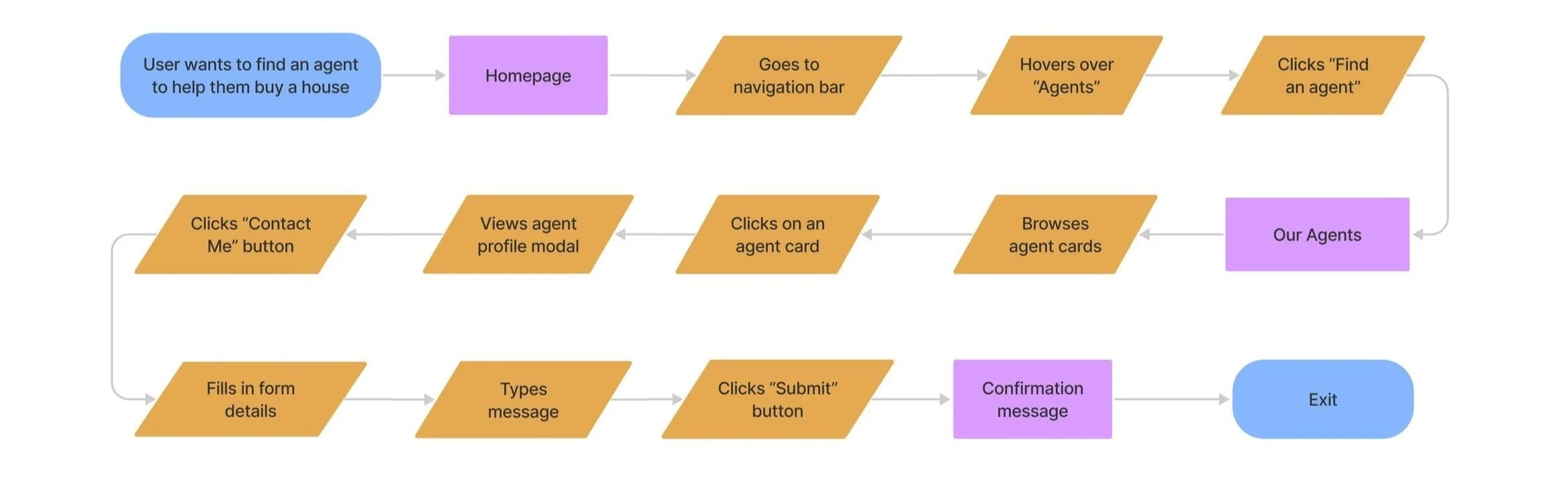
Task & User Flows
Based on the needs I identified from my research, I determined the task flows that would need to be created for users to complete their goals. These flows helped me flesh out what screens and features would need to be created for users to interact with the site and complete tasks during usability testing.
User stories:
As a homebuyer, I want to send a message to DCP to be connected with an agent.
As a homebuyer, I want to browse available property listings on DCP’s website.
As a homebuyer, I want to schedule a showing for a house I’m interested in viewing.
I created a user flow to encompass all the potential use cases and paths a user could take to access the site.
Low-fidelity Sketches
Referencing my sitemap, flows and UI requirements, I sketched ideas for each screen that showed a variety of layout structures and navigation patterns.
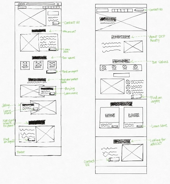
Homepage sketches
Buying page sketches
Mid-fidelity Wireframes
After getting feedback from my peers at a design critique meeting, I created the mid-fidelity wireframes in Figma and prepared for usability testing.
A Hitch in the Road: Business Goals vs User Needs
Although my research demonstrated the importance of having an Agents page, the company resisted because some of the agents didn’t want to receive cold contacts - they preferred to work in warm networks.
Business goal: attract new clients to contact them.
User goal: find an agent to represent them to buy or sell a house.
Establishing a relationship requires client trust, which starts when they meet an agent and builds through their experiences with them. But because of this stakeholder feedback, I removed the Agents page before going into usability testing.
4. Test
Usability testing goals
Identify points of friction in the design & rectify deficiencies
Determine the usability of the design for users
Determine if the site helps users build trust and make entice them to contact DCP to work with them
Methods
Mid-fidelity Prototype
Usability Testing
Affinity Mapping
Wireframe Priority Revisions
Usability Testing
I conducted moderated think-aloud testing with 6 participants with a mid-fidelity prototype so users would focus on the experience of the product, rather than evaluating the visual design.
Convincing Stakeholders with Usability Testing Results
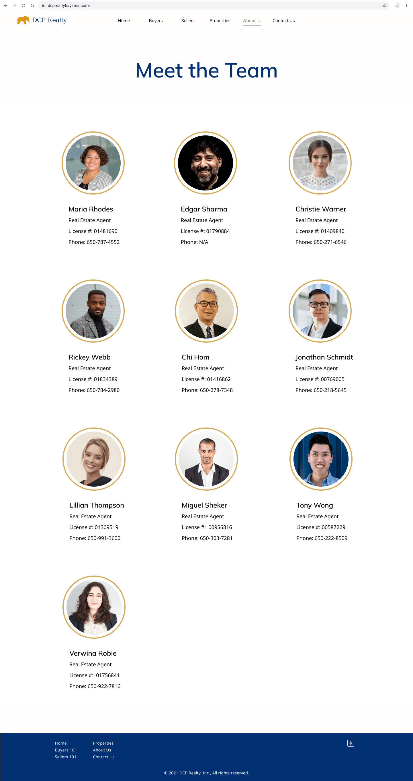
During usability testing, all participants asked about who the agents were. They appreciated having info about the company to begin building trust, but they ultimately would be working with an agent, and the contact form was vague and felt like sending a message into the ether.
I went back to DCP with this data and convinced them of the importance of having an Agents page to attract clients. They agreed to include the page, and I added it back into the design before moving on to creating the high-fidelity wireframes.
Testing Insights & Priority Revisions
I created an affinity map by gathering the qualitative user feedback from testing, grouping notes, and identifying patterns to elicit insights on how to make improvements to the design.
Users couldn’t get to the property listings from the Buying page.
Solution: Add a button that takes users from the Buying page directly to the Properties page.
The Contact Us is vague, and users want to know who the agents are.
Solution: Add an agents page to showcase all available agents or at least allow people to confirm whether an agent works for the company.
Users want to filter listings by their own specific criteria, rather than having to look at all listings without knowing the details.
Solution: Add an advanced filter to the Properties page so users can filter by size, price, number of beds/baths, etc.
5. Design
Design Goals
Create a recognizable brand identity and logo
Apply UI design to the website wireframes to offer a cohesive visual identity and user experience
Create high-fidelity mockups to create a final prototype and prepare for handoff
Methods:
Mood Board
Logo Design
Style Tile
High-fidelity Designs
High-fidelity Prototype
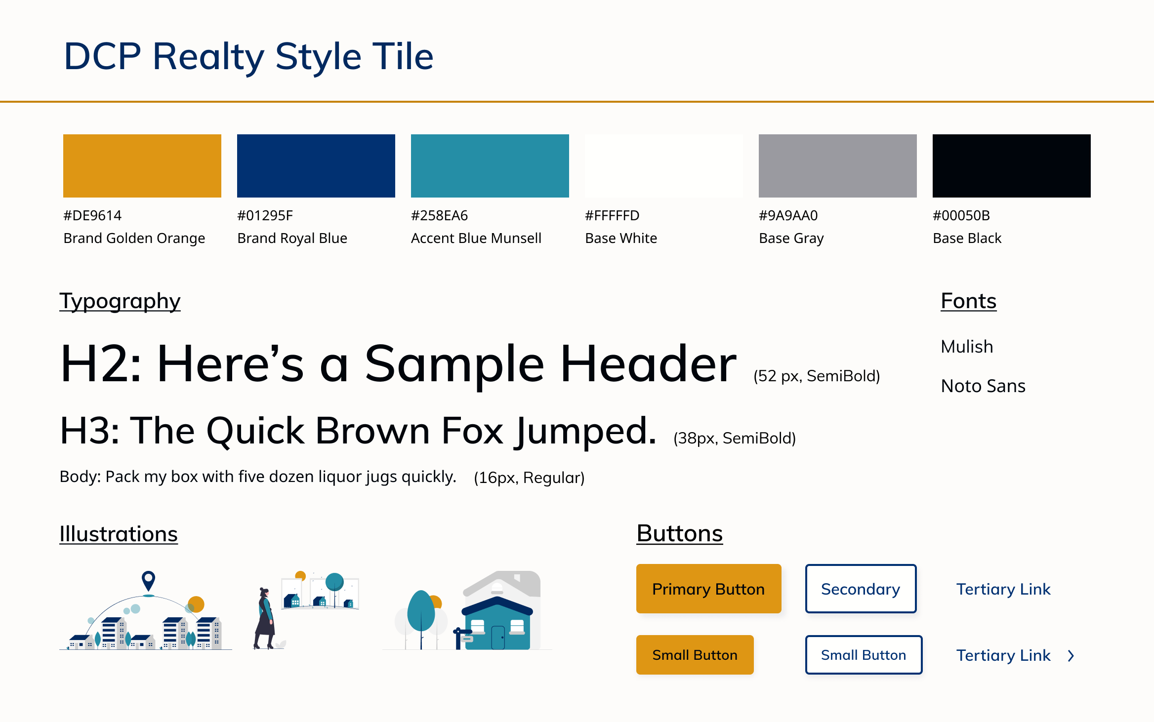
Style Tile
To pull the brand identity together, I created a style tile that I could hand off to the company so they could understand the site’s visual language and use it as a brand style guideline.
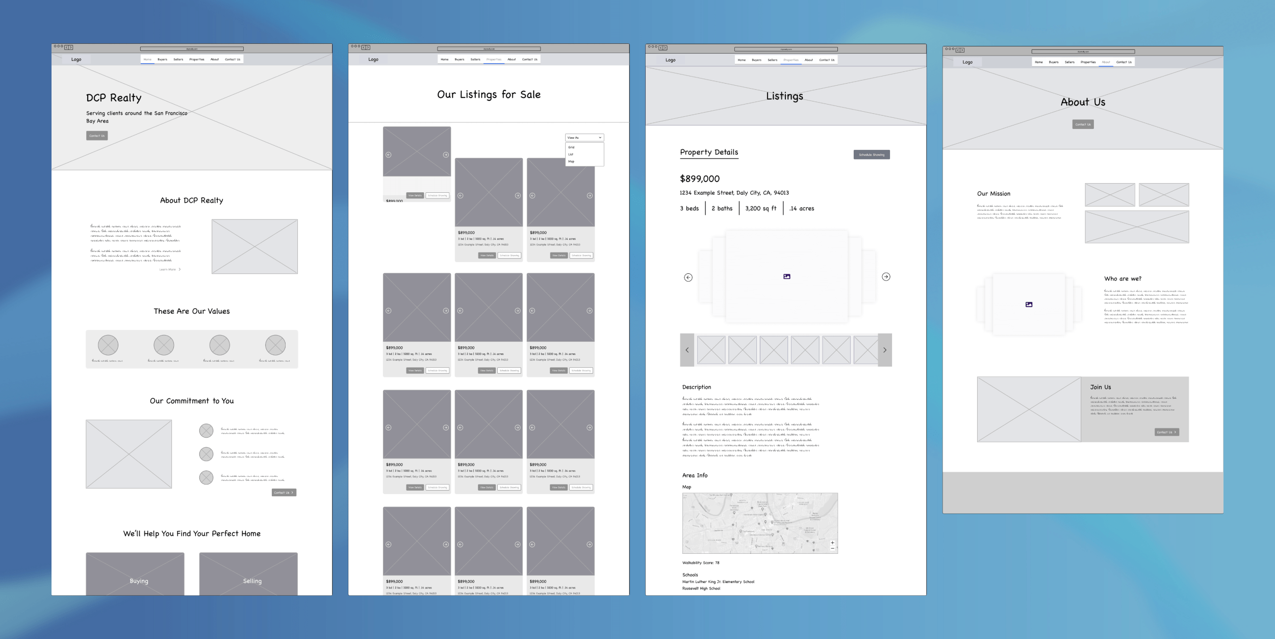
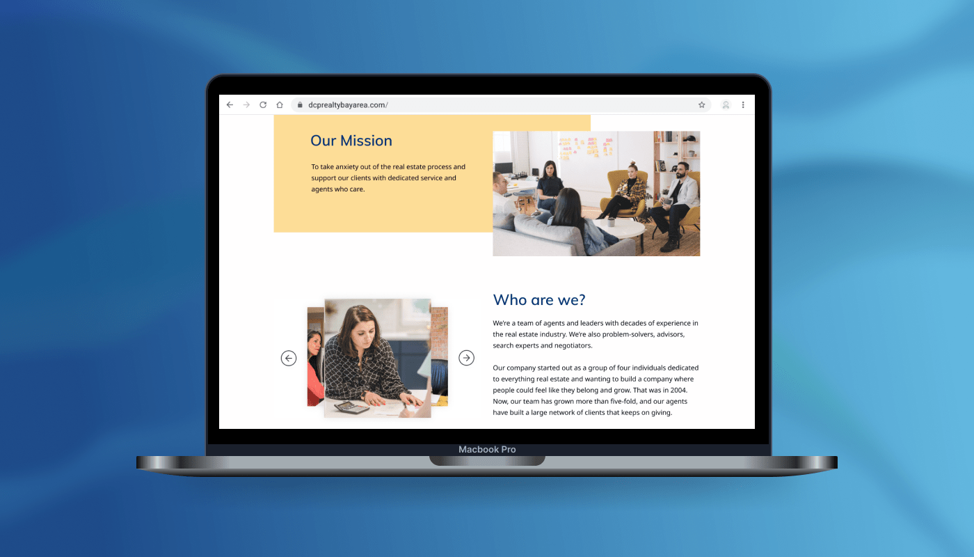
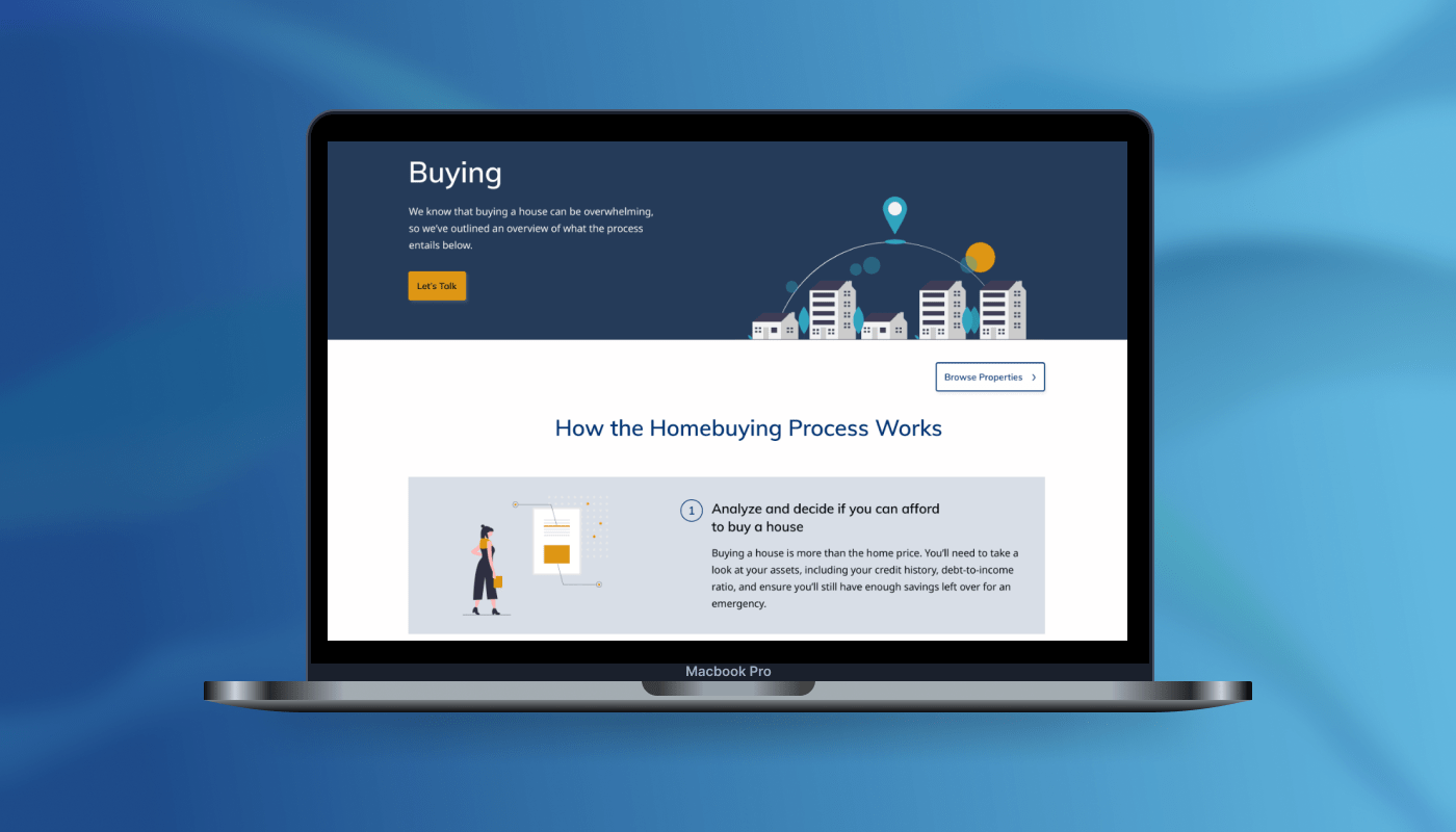
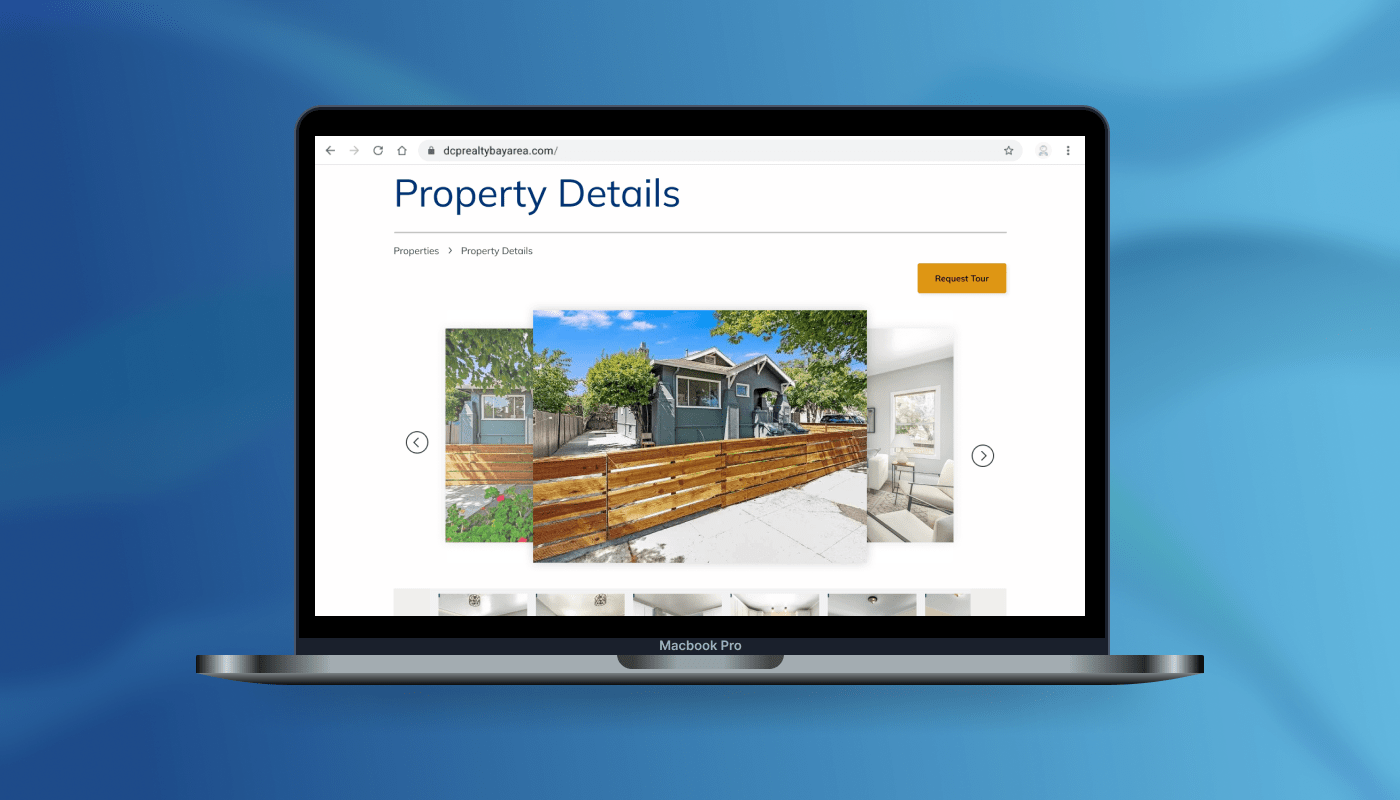
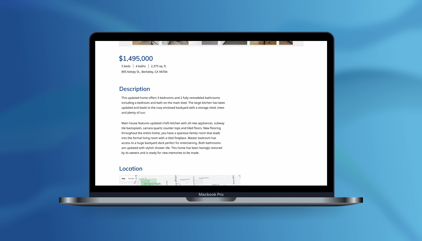
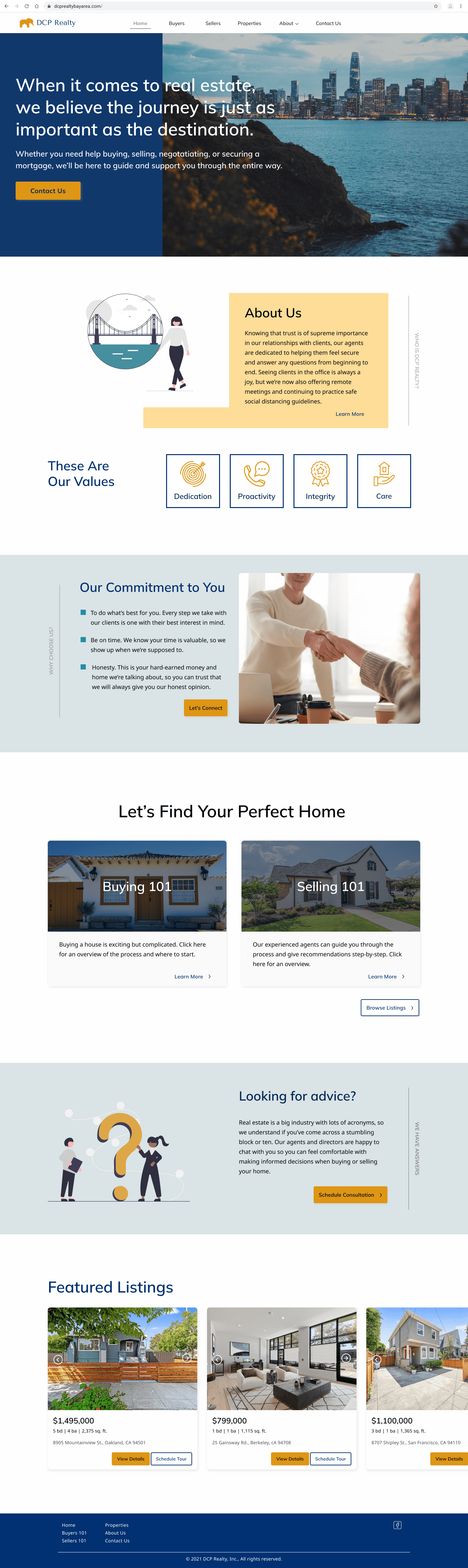
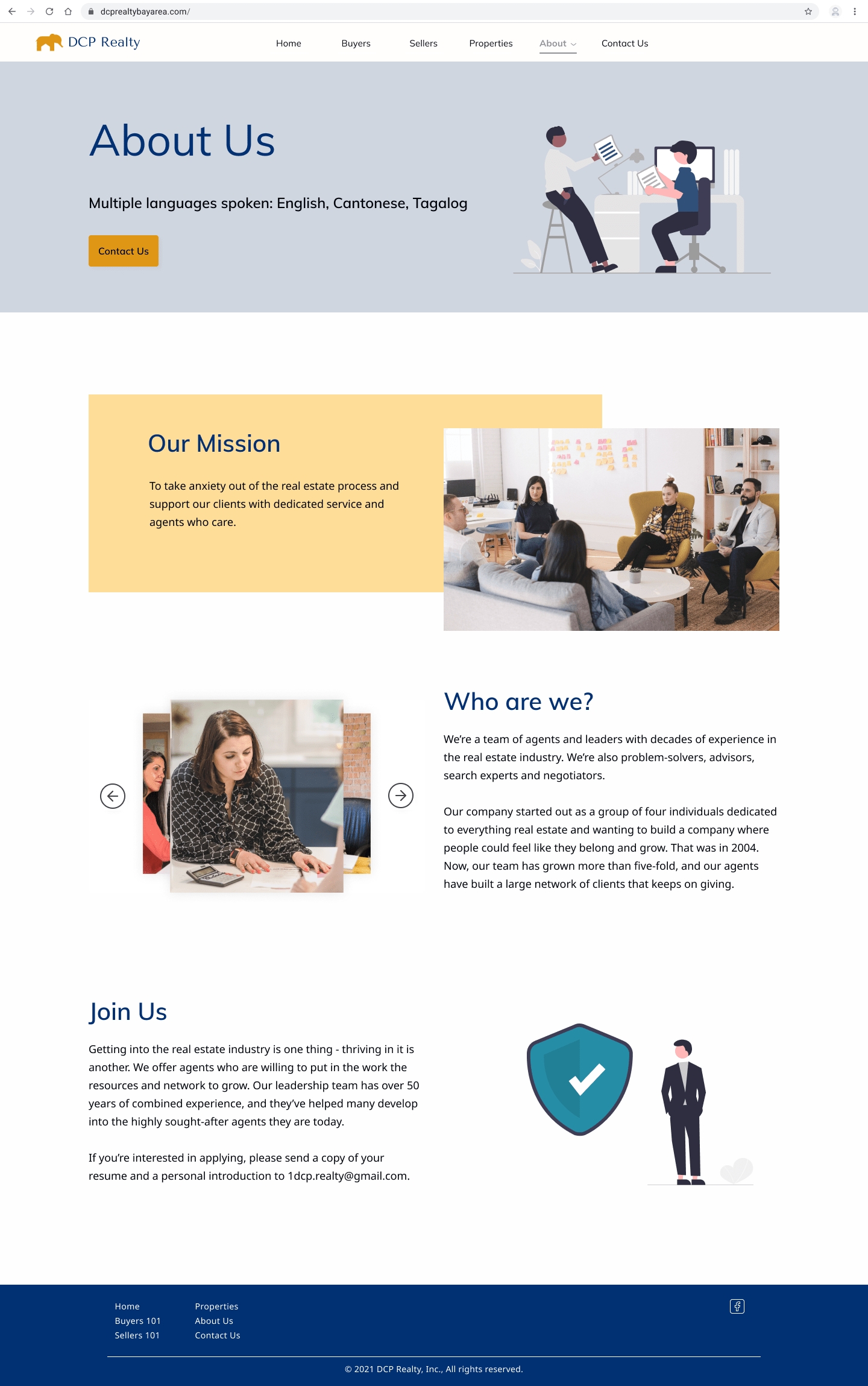
High-fidelity Designs
After getting feedback on my mid-fidelity wireframes, it was time to create the high-fidelity designs. I applied the color palette and branding to create the site’s visual identity.
And after many more hours of research, I wrote the copy for the Buying and Selling pages that guide the user through the homebuying and selling process, as well as tips on how to get started.

High-fidelity Prototype
Reflection & Next Steps
Key Learnings
Using data points from usability testing feedback can help me convince stakeholders to be on board with my recommendations (e.g. Agents page)
Using fonts that are often taken less seriously, such as Chalkboard or Comic Sans, in mid-fidelity wireframes can help users focus on functionality but make it difficult to envision the realistic design of the site
When working with a client, I should find out more about their work process and setup at the beginning to inform how I structure my designs later on (e.g. Who will manage Contact Us requests from the site?)
Applying a mathematically scalular approach to the typography can theoretically create a pleasing visual design but isn’t always the best choice, depending on the site’s needs and structure.
Next Steps
Purchase domain name and Squarespace plan
Design implementation
The site will be implemented on Squarespace because it has multiple IDX plugin options with good track records of running smoothly on customers’ sites.
Install IDX plugin
This plugin allows the site to populate MLS listings from the company’s agents and all related information. It also allows users to browse listings on a map view and filter results based on their criteria.
Monitor and analyze site analytics to continue assessing the effectiveness of the site for users
View Other Projects

Cookie Jar App Product Design Case Study

Kaus Insurance E-commerce Website Case Study
DCP Realty Website Design Case Study