

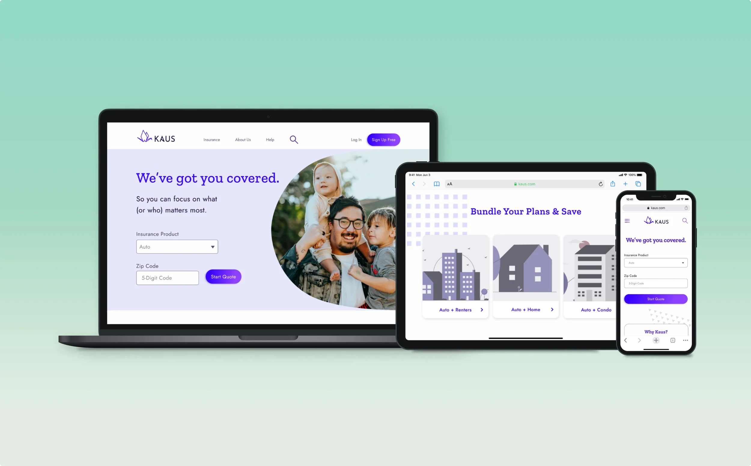
Kaus: Responsive Insurance Website Case Study
How might we digitize an insurance company’s offerings to attract a younger customer demographic?
My Role: UX Researcher, UX & UI Designer, Web Designer
Overview
As a large insurance company that’s been in business for 30+ years, Kaus was looking to pivot to a new business model by digitizing its offerings and purchasing process. The company provides many types of insurance: property, motor, liability, marine, aviation, life, health, and protection.
It had traditionally relied on selling its 350+ offerings through regional selling agents and was looking to target a younger age demographic than its current customer base.
The Challenge
As the insurance industry has shifted to a newer direct-to-consumer model, Kaus is losing market share to companies with online offerings and optimized websites. Kaus needed to shift from its traditional B2B model to a B2C/DTC one with a new e-commerce style website.
Project Goals:
Design a responsive e-commerce website that is pleasing to use and allows customers to easily browse products.
Keep costs low and provide easy solutions for customers.
Brand refresh: design a new modern and fresh logo for the company that is trustworthy, modern and fresh, clean and clear
Project Constraints
Packages are optimized for individuals that fit similar personas, so there are no a la carte options, and customizations are at the basic level.
In the future, the site will have a logged-in area for customers to manage policies & their accounts, but this first iteration will not include this.
The Solution (Spoiler Alert)


Design Process
-
Methods
Market Research
Competitive Analysis
1:1 User Interviews
Card Sort
-
Methods:
Sitemap
UI Requirements
Task & User Flows
User Personas
-
Methods:
Brainstorming
Low-fidelity Sketches
Mid-fidelity Wireframing
-
Methods:
Style Tile
High-fidelity Designs
UI Kit
-
Methods:
High-fidelity Prototype
User Testing
Priority Revisions
1. Research (Empathize)
Research Goals
Learn about the insurance industry, key players, competitors, and the state of the market
Understand users’ feelings towards different types of insurance and the purchasing process
Understand how individuals shop for and purchase insurance
Uncover users’ thought patterns when exploring options and navigating an insurance website
Identify user pain points when using or purchasing insurance
Market Research
I started by conducting market research to develop an understanding of the insurance industry, key players and who they serve. For the e-commerce website, I decided to focus on promoting Kaus’ auto insurance. It’s one of the company’s most profitable products and has low barriers to entry (no enrollment periods or strict qualifiers).
Market Research Findings
U.S. Insurance Industry & Market
Overview: The US insurance industry is vast and siloed, with insurance companies typically specializing in 1-4 types of insurance.
Market leadership:
5,965 total players within the US insurance market
Market leadership is measured by a variety of factors, including membership, total amount of direct premiums written, market share, market cap and revenue.
Market value: U.S. insurance industry net premiums written totaled $1.32 trillion in 2019
Profitability: The best-selling and most profitable type of insurance to sell is auto, due to its large market size.
Customer Experience & Satisfaction
With companies continuing to digitize offerings and compete on price, customer experience will become the defining factor for customers to stay with or switch providers.
Consumers increasingly purchase directly from insurance carriers, and brand perception remains critical.
There’s a customer expectations gap between insurers and customers
What customers care about: knowledgeable salespeople, product comparison tools, and quick and easy checkout.
What they care less about: a dedicated mobile app and product recommendations that match their buying habits.
To foster acquisition and retention, companies need to focus on digital experience, cybersecurity and price, particularly with younger generations.
Competitive Analysis
Following my market research, I conducted a competitive analysis. I identified direct and indirect competitors, as well as gained an understanding of their positioning, messaging, strengths and weaknesses. This later helped me determine Kaus’ market opportunities and unique selling propositions.


1:1 User Interviews
1. Organize participants
2. Create interview guide
3. Interview participants
I wrote an interview guide that included a script in preparation for user interviews. The questions asked about their experiences obtaining personal insurance, their contact preferences and perspective on insurance companies.
I gained an understanding of their shopping and exploration processes, as well as key elements they look for when considering becoming a customer. Then, I created an empathy map and affinity map to categorize user feedback and determine actionable steps.
Empathy Mapping
I created an empathy map of all the feedback from user interviews to draw out patterns that emerged from the data. I took my transcribed interview notes and transferred each point onto individual sticky notes. I grouped notes together, created categories, and extracted an insight from each group to determine a corresponding need.
Card Sort
I then conducted a card sort to understand users’ mental models when arriving at and navigating through an insurance website. The card sorting activity required participants to take the provided cards (e.g. find an agent, file a claim, contact form, etc.) and group them into categories based on similarity.
I used a hybrid card sorting method that provided existing categories for users but also allowed them to create their own categories as they saw fit. The results served as the foundation for the site’s information architecture.
Primary Research Key Insights:
Priorities: Secondary research showed price was central, but interviews showed that value seemed to be the more important factor. Trustworthiness was also key.
Exploring options: All users said they would start the process with an online search and compare quotes if looking to purchase new insurance.
Contact preferences: Are not age-dependent. Different individuals prefer handling everything online, while others prefer phone calls.
Surprising find: None of the participants could remember a time in which they accessed their insurance company’s website after becoming a customer. As such, the landing page will focus on capturing new potential customers, rather than serving existing ones.
2. Define
Define goals:
Define the user I’m designing for
Determine users’ needs based on my research insights
Come up with ideas for content/features and organize them based on priority
Ideate on the user experience design and visual layout
User Persona
Using the insights I uncovered from my research, I created a user persona to depict Kaus’ target customer. User personas help me empathize with the user and serve as a guide point throughout the design process when making critical product decisions.
The main focus was building a persona for the age demographic Kaus was targeting and potential ways for the company to target and capture those users.
3. Ideate
Ideate goals:
Define and prioritize product features
Determine the app’s information architecture, UI requirements and main user flows
Begin sketching product ideas and create wireframes
Brainstorming & Product Roadmap
Using a rapid ideation mind mapping technique to generate ideas for the site. I then created a product roadmap to prioritize the most promising pages and features.
Sitemap & UI Requirements
Knowing that users were most interested in building trust and getting a quote, I included a dedicated About Us page and the Quote Estimator prominently displayed on the landing page. I tried to keep the hierarchy as simple as possible.
I then created a separate UI Requirements doc that outlined the contents of each screen in detail to keep me on track when beginning to sketch.
Task & User Flows
Because interviewees noted that they didn’t access their insurance company’s website as a customer, the flow and designs focus on capturing new customers rather than serving the needs of existing ones.
Based on my research, I made sure the Auto Insurance Quote Estimator task flow included a streamlined checkout option so users could purchase on the spot without having to navigate elsewhere.
I then merged the task flows to begin creating a comprehensive user flow, adding in additional screens, features and connections to encompass all the potential use cases I could think of.

Low-fidelity Sketches
Referencing my sitemap, flows and UI requirements, I began sketching as many ideas as I could for each screen that showed a variety of layout structures and navigation patterns. I’ve included a couple of them below.

Mid-fidelity Wireframing
Next, I went into Figma to outline the product’s layout and user experience. Wireframing before higher-fidelity designs helps me focus on the site’s navigation, structure and functionality, rather than on the visual design.

4. Design
Design goals:
Create a recognizable brand identity and logo
Apply UI design to the designs to offer a cohesive user experience
Compile a style tile and UI kit that encapsulate a clear visual identity
Create high-fidelity mockups to create a prototype and prepare for handoff
Logo Design: Sketching & Ideation
I started my logo design process with Kaus’ brand keywords (trustworthy, modern & fresh and clean & clear) and added “helpful, personable and established) to round out the brand’s identity. Using those, I created a word map to begin generating some inspiration for the logo icon and wordmark. Below are some of the ideas I explored before landing on my final logo design.

House logo

Key logo

Three trees logo

Crane logo
Final Logo Design
The final design I landed on was the paper crane logo. In Japanese culture, paper cranes are made together in groups to support a larger cause. This translated into a sense of community, trust and looking out for one another.
I chose this light and simplified form to render the modern, fresh and clean aesthetic Kaus was looking for. Furthermore, I adjusted the bar in the “A” to imitate the crease at the bottom of the crane for visual symmetry.


UI Kit
I created a UI kit consisting of all of my components that determine the product’s functionality. Having an organized UI kit helps speed up the design process for building future pages and enables maintaining a consistent, cohesive experience.

5. Test
Test goals
Identify points of friction in the design with users and rectify deficiencies
Determine the usability of the design for users
Understand what features are the most or least engaging for users
Observe user behavior and gather feedback
Usability Testing
I created a high-fidelity prototype in preparation for usability testing where users were asked to complete specific tasks. Usability testing allowed me to observe users’ actions, reactions and ability to complete the key task flows.
Usability Testing Results
Get a quote estimate for an auto insurance plan
100% completion rate
99% error-free rate
Learn about Kaus to determine your interest in opening an auto insurance policy with the company
100% completion rate
98% error-free rate
Participants appreciated that the site warned them before they left the page in the middle of the Quote Estimator flow to mitigate lost data and user frustration.
Priority Revisions
Insight: While going through the Quote Estimator flow, participants were confused because they didn’t get to select their policy option. (This was due to time constraints.)
Solution: Design two additional screens for the Quote Estimator: Enter Driver Info & Select a Quote.
High-fidelity Designs


Reflection & Next Steps
Reflection
Throughout this project, I learned a lot about the Design Thinking process and how crucial it is to consider every step, as each phase’s learnings feed into the next.
Components! I saw how useful it is to create and use components so that any changes I made would be reflected across the entire design. Doing so, I felt confident that my pages were modular and cohesive.
In hindsight, I could’ve been more effective in conducting my market research by knowing what to look for. Knowing how the population is affected by the health insurance system wasn’t helpful to know when designing the Auto Insurance purchasing product. I ended up having to go back to reconduct my research with the right focus.
The user persona “About” section doesn’t need to be so long to include minor details about the persona’s life. It’s enough to provide a short background so anyone reading it can get a sense of who the user is without wasting time.
Next Steps
Design implementation & handoff
I created my handoff doc in Figma, which makes things easy with an Inspect tab that shows the CSS code the developer needs to execute the build. However, if needed to further help the developer, I would create additional documentation, such as designs marked up with annotations.
Additional pages and features to design:
Contact Us page
Sign Up
User account sections: profile page, filing a claim and getting an insurance ID card
Health insurance landing page
Design the quote estimator for usage on tablet and mobile
Continue testing and analyzing the site’s analytics to surface any usability issues
View Other Projects

Cookie Jar App Product Design Case Study

DoorDash Adding a Customer Loyalty Feature Case Study
DCP Realty Local Business Website Case Study